The joyfulness that comes with adding colour to your life – Simple Photography Tips
- Michael Blyth

- Aug 13, 2025
- 4 min read
Five simple photography tips on Joyful Photography - Camera and Phone Camera
Choose a bright summer flower – Pick a vibrant bloom with rich, saturated colour
Select a contrasting bright summer flower – Add energy and visual interest by choosing a second flower with a different colour that pops against the first
Balance with a softly coloured summer flower – Introduce a gentle pastel bloom to create harmony and contrast with the bold colours
Enjoy the process – Slow down, experiment with angles, light, and composition, and take joy in capturing beauty
Hang on your wall
My wife has been reading a book, and shared page-loads with me as I drove from a weekend portrait session in Yorkshire, my fourth with this lovely family, 2013 being the first.
The 'page-loads of sharing' were from a book by Ingrid Fetell Lee, called Joyful. https://amzn.to/3V228sQ
The first chapter talks about colour. I read more that evening, lying half-submerged in the bath - it made me realise that although nearly all of my portrait work is presented in black & white (monochrome), these articles, and all my other work is in colour.
In reality, although the higher the IQ the better the response to greytone, it is colour that we were created to see, and it is colour that can be a huge blessing in many ways.
The effects of bright colour on the brain, and thereby the rest of that body of yours, are considerable, so let's look at 'joyful photography'
Consulting a 'well resourced friend', resulted in the following, which because it's important I will share here.
Bright colours have a surprisingly strong and measurable impact on both the human brain and the body, not just aesthetically, but physiologically and emotionally, i.e. mental health.
Bright colours, especially those with high saturation, send strong signals to the visual cortex, which heightens alertness and attention. This is why they’re often used in advertising and safety signage.
The brain links colours to past experiences and cultural associations. For example, bright yellow may evoke sunshine and warmth, whereas bright red can signal danger or excitement.
Certain bright colours (especially warm tones) can activate the brain’s reward pathways, stimulating Dopamine release and increasing motivation and optimism.
Warm, bright colours like red and orange can subtly increase heart rate and blood pressure, preparing the body for action (a mild fight-or-flight response).
Exposure to varying colours can cause hormonal responses, energising colours tend to boost adrenaline, while calmer bright tones (like turquoise) can reduce cortisol, the stress hormone.
Bright colours stimulate the retinogeniculate pathway in the brain, which sends priority visual information to the thalamus and visual cortex. The brain essentially says: "this colour stands out, it might matter' as also happens with brightly coloured safety equipment..
This all affects how your surroundings and the presence or absence of bright colours affect how you feel, and work.
So let's start a journey,
I'm going to use images of brightly coloured flowers as examples, and perhaps help inspire you to decorate any dull places with flashes of colour, which I'm sure will make you feel happy.

If you've a camera with close-up facility, great, use it. If you're using a phone, great, don't let its restrictions restrict your personal inspiration.
I was using an i-phone 14 pro, with which, as long as you don't try to get very close, the images are acceptable for personal use, and maybe a medium sized print on your wall. Ideally I should have used my Nikon D810 with a 1:1 macro lens.
Let's run through these pictures and I'll make a few comments.
Image One. The sunflower in it's normal colour is almost the ultimate in bright colours that encourage happiness, associated with sunlight, warmth, and optimism.
You can go for a whole field full, preferably on a sunny day, and preferably requiring a special trip to the fields of Europe, although that goes against my environmental photography ethos - but tempting!
Close up is just fine, perhaps grow one in your garden next year, whether a window box, or one that is open to the public on high days.
In this image I've cropped out some of the petals in favour of the swirls in the middle, but I suggest you play around. The whole interaction will do you good, as will watching the bugs and beasties that feed on the poleen, or upon the bugs that feed on the pollen!
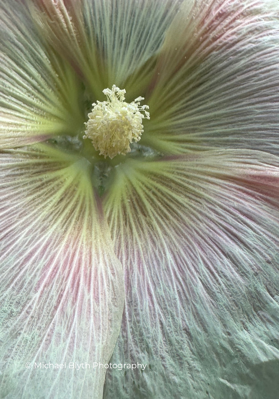
Image Two, is quite a mix of shades, the creamy anthers along with the white/pink veining bring a much more gentle brightness, and it maybe that you are at the stage where bright is tooo bright.
The composition is such that the anthers are sitting smack on the intersecting thirds, making it a gentle and comfortable image.
The petals themselves provide wonderful texture, and if you had a seriously close up lens the veining stand out as another image altogether.
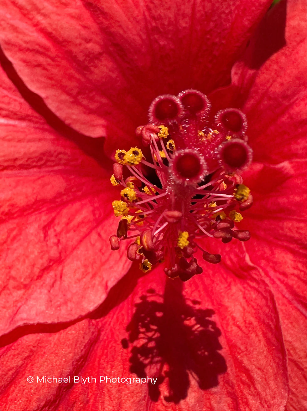
Images Three is another 'oh so bright' one. A notable feature is that using my i-phone 14 in close gave me the dilemna of what I could have in focus - it was either the the five fluffy stamens, but not the petals, nor all of the anthers; or the other way around.
I feel that the mix of the yellow anthers and the red of the petal are a better producer of bright and cheery than I've had got from the stamen.
With a camera and macro lens, you could have all in focus.
Why don't you go somewhere that has bright flowers and experiment? Perhaps you'll be happy enough to print some for your wall, to bring joyfulness to the room.


As a direct result of reading this lovely article, today I wore cropped yellow trousers with a bright burnt-orange belt, linen shirt and necklace made of turquoise, green, yellow and orange ceramic discs and Michael's absolutely right - it does make a person feel joyful!
Sarah